Professional Project
DocSpera Mobile App
Native-feeling mobile companion to the DocSpera portal: designed for surgeons checking case state, schedules, and CPT codes between procedures.
Problem Statement
Similar to the main webapp redesign, the companion mobile application required an modernized redo for users. This included redesigning existing funtionality, but idenifying improvements to port over including existing DocSpera functionality, new push notifications, and building in biometric native functionality
Process
Identify workflows and audit
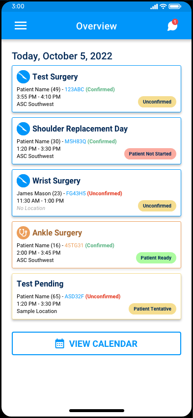
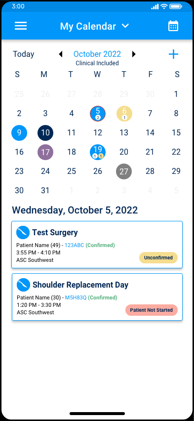
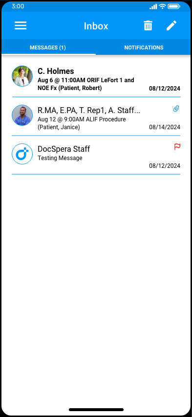
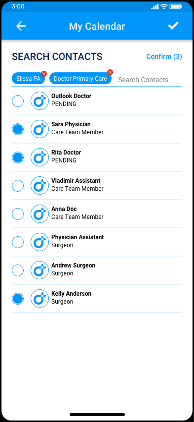
Mapped the realistic workflows a surgeon or provider would do when opening the app: between procedures, figuring out their schedule, and staying up-to-date with their careteams.
Built a mobile-specific component set
Using the web versions components as a base, I pared them down to a smaller kit of cards, status badges, mobile-friendly variants, and list rows tuned for thumb reach and one-handed reading.
Designed status as the primary signal
Color and label do most of the work on small screens. Confirmation states, readiness, and unconfirmed cases each got a distinct visual treatment so a surgeon could triage the day at a glance.
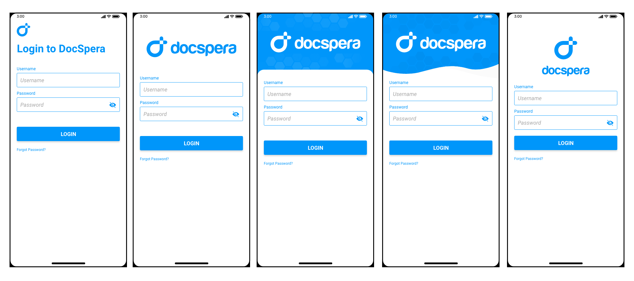
Validated screen variants before committing
Ran multiple visual directions for the case header and overview rows side-by-side before locking the final pattern, which is where the screen variant board came from.
Mobile Screens
Design Decisions
Component library, in miniature
A standalone mobile component sheet kept the team aligned on spacing, density, icons, and status treatment for easy access.
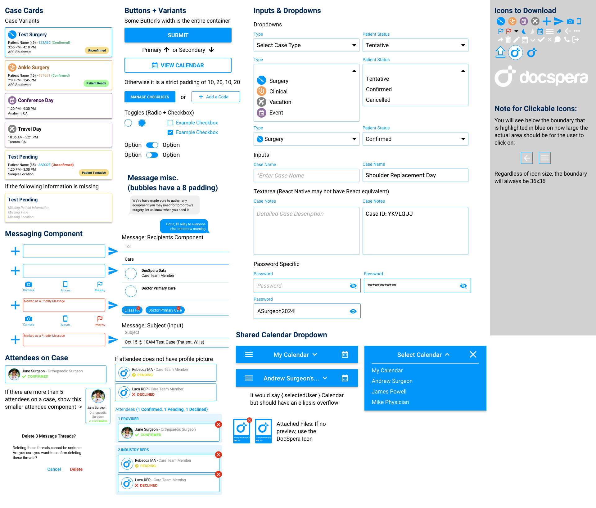
Variants before commitment
Before locking screen patterns, I produced a side-by-side variant board to compare information density, status placement, and process for open discussion and review
Outcomes
Delivered a coherent mobile companion that providers can use. The screens hit a consistent density, responsive across native phone settings, status reads at a glance, and the underlying component sheet gives DocSpera a foundation to keep extending the mobile experience.
Metrics
Metrics coming soon